The social ties of immigrant communities in the United States
Amac Herdagdelen, Bogdan State, Lada Adamic, and Winter Mason
This paper uses an extensive Facebook network dataset to document the extent to which migrants from different countries have social ties to American citizens. These uniquely rich data were accessible to the authors because they all worked at Facebook or Instagram at the time. Before diving into the paper, a couple points worth discussing up front:
Most purely demographic research that tries to leverage digital trace data must work hard to justify both the representativeness of the data and the necessity of using it over old-school alternatives. In contrast, research on social networks and social integration does not face these same problems. There are very few good alternatives for studying social networks, and none achieve the same scale as Facebook. Further, sampling issues aside, the authors do not need to argue that their data capture a genuine snapshot of the social landscape because Facebook connections arguably define that landscape. They do this work anyways, but I don’t think they really have to.
Although this paper is ultimately about the data and the methods used to analyze the data, the authors are deliberate in outlining the history of research on assimilation before diving into it. I appreciate this as a reader and it’s a good reminder not to cut corners when developing the theory to go along with a methods- or data-focused project.
Now, on to the data
In this paper the authors use a sample of 10 million Facebook users who list a hometown outside the US with at least two friends in their home country and the US. From these users the develop two aggregate measures, compatriot affinity and the exposure ratio. Compatriot affinity measures the proportion of all edges leaving any user from a given country that connect to another user from their same home country. For example, immigrants in Cuba have highest compatriot affinity - roughly 60% of their Facebook friends are also from Cuba. The exposure ratio measures the opposite, or the proportion of all edges leaving any user from a given country that connect to Americans. The two are almost the same, with differences being due to friendships between migrant groups. Here are the two plotted against each other. You can see Cuba in the top left.
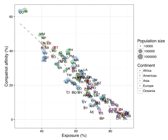
This simple description is interesting in itself since it shows how migrants’ social experiences in the US differ depending on their country of origin. This level description might be hard or impossible to obtain with accuracy through traditional methods.
The authors also include a questionable attempt to compare the geographic and online integration of immigrant communities. To measure geographic integration they compute dissimilarity, which is a very common and popular measure of neighborhood segregation. Usually dissimilarity is computed at the neighborhood level, and it’s magnitude can be interpeted as the proportion of people that would have to move to achieve a state of perfect diversity where every neighborhood’s composition matches the population composition of the broader region. Here, the authors use cities intead of neighborhoods, so their dissimilarity measure refers to segregation between major cities in the US instead of between neighborhoods. It’s hard to interpret this since we don’t usually think about cities being segregated from each other, and the though experiment of people moving between cities makes somewhat less sense. I don’t really think this analysis succeeds at what the authors intended, which is to compare geographic and online integration.